It’s almost time for me to start taking down my Christmas decorations, and that always puts me in the mind of massive historical logistics efforts, like marching war elephants over the Alps to attack Rome, or building a web site.
Interesting historical note: there is no such thing as an actual “war elephant.” Hannibal, the famous general who used elephants to attack Rome, took regular peaceful elephants and made them memorize Bob Parson’s® 16 Rules for Success in Business and Life in General to produce bloodthirsty killing machines. (Rule #4, about visualizing the worst possible scenario, was edited slightly, given that there was a very good chance you were going to be eaten.)
Anyway, I’m pretty sure I was rambling on about e-commerce last week, and how the little guys can compete against the likes of Amazon. This leads us almost directly to a look at how e-commerce sites–particularly those in the bike business–merchandise their products.
However you look at it, digital merchandising sucks. Everything that gets summed up instantly when a customer walks into your store, now has to be analyzed, categorized, broken into attributes that can be compared to similar products, formatted, and displayed. OK, maybe it’s not as hard as I’m making it sound there, except that it is. When it’s done really well, shoppers get the information they need without having to live chat or call or email–or go to another site. But doing it well is more challenging for some businesses than others. If you’re a small retailer, it’s important not to scale yourself into oblivion when it comes to assortment, or your product information is likely to bury you. Better still, only sell a few items and sell them to a clientele that doesn’t give a shit about anything but a product’s color. Consider opening yet another store catering to hipsters.
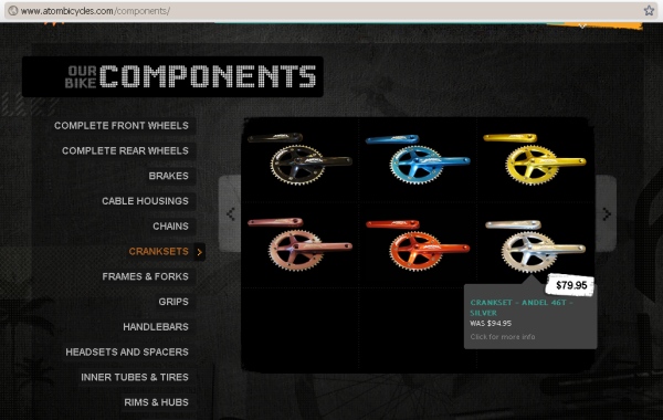
I found the source of the screen capture above, Atom Bicycles, doing what I sometimes do to torture myself: looking at what Smashing Magazine thinks are the best retail site designs. The cool thing about this is that most “user experience experts” don’t actually know what it means to truly participate in anything, beyond maybe collecting shoes (male) and “productivity enhancing apps” (female). Going to a “sexy geek” for recommendations about site navigation isn’t such a bad idea, but trusting said geek to also know whether a site’s navigation and product pages “work” or not is another story entirely. Smashing does what a lot of designer-centric site “reviews” do, which is punt on content and actual human usability by focusing exclusively on sites that don’t ask a lot from their shoppers (or people writing articles about web sites). This means the list of “35 Beautiful E-commerce Sites” they offered last year consists almost entirely of fashion designer direct sales sites, hipster boutique t-shirt stores, fancy wine sellers, and purveyors of expensive hand-madey looking crap (usually for kids, because polite kids in affluent but green families tend to stay mum, even when given a gift that “sucks wet ass”). No, seriously. That’s all they cover in this article. I think there are like seven t-shirt places alone.
I particularly like the text blurbs they offer about why each site is great. You can read them all, but here are my favorites, in no particular order:
- “The website combines jQuery and Flash, which slows the loading speed, but given its objective, this is not critical.”
One wonders what the objective is if it’s not pleasing customers with a site that functions well, but I guess some customers like the kind of good, saucy teasing that only a shittily loading page can offer. This likely explains the popular of mistressursulatellsyoutositandstay.org’s otherwise infuriating “under construction” home page.
- “The products are not tagged or grouped into categories, but this is hardly an oversight given the store’s small size.”
The fact that the seat belts don’t work is inconsequential, because the car doesn’t run anyway.
- “Cellarthief is a beautiful online wine store that sells only three wines at a time. The Apple.com-inspired content blocks against the real-looking wood background shows how the classic spirit of the wine industry is fused with modern design values.”
By “classic spirit,” I assume they mean “wealthy enough to start a web site without requiring profitability.
- [blank]
Yes, about one site, Hokey Croquis, they actually didn’t even bother to write anything, which turned out to be OK, because the retailer seemed to have gone out of business and the site removed anyway. To be fair, the “Not Found” page was clear and concise and had clean but interesting typography.
You get the idea. In fact, no fewer than four of the random sites I tried to click through to check out were now gone. Domain name sold. Out of business. Maybe they were too beautiful to live. Most telling, the word “information” appears nine times on this article’s page–once in the article itself, seven times in the comments people left, and once in the instructions on how to leave a comment. That pretty much tells us everything we need to know.
See, a good e-commerce site is based on solid information–there’s something substantial at its core. It’s that availability of information that led to suggest more brick-and-mortar shops consider getting themselves online and into the game, because they do have something to offer that many other sites don’t: substance.
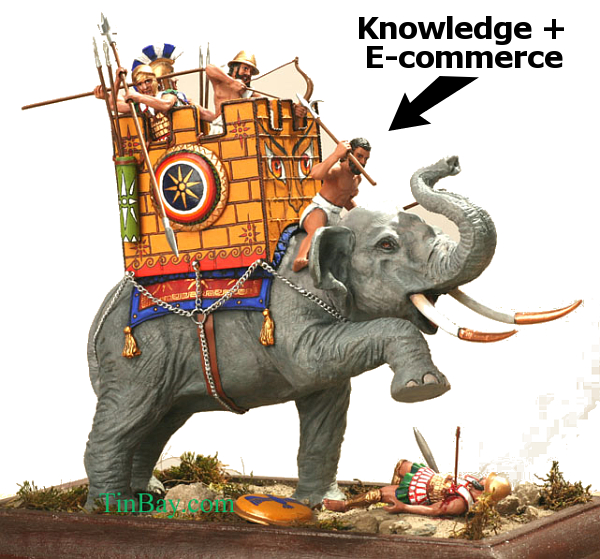
They have a story to tell, and they have product knowledge. That’s the war elephant in the room: knowledge. It’s what separates a good e-commerce site from a bad one.
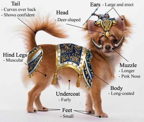
War Chihuahuas can appear to be enormous, slick, impossible to compete against, until you see them to scale, held up against the enormous knowledge and authenticity of a genuine store, a quality bike shop. You can dress up a site that lacks those qualities, but something’s always missing. Small retailers might not have the fanciest outfits and shiniest weapons, but that story they have to tell, that authentic core–the heft–can make a big difference.
2 Responses to “War Chihuahuas”
Sorry, the comment form is closed at this time.


I’m feeling motivated now. Time to don my codpiece and go to battle!!!
Codpiece up!