Ah, the Internet, that terrifying behemoth hell-bent on destroying small business in America. Or not. You know how politicians start to talk about the evils of class warfare only after a large enough percentage of Americans are poor enough to face a little pepper spray? How class warfare isn’t ever brought up in relation to, say, an orchestrated effort to carpet bomb the middle class? Well, there’s a similar bit of tomfoolery afoot when it comes to the Internet. Only when the Best Buys and Targets of the world start to get hurt by the likes of Amazon do The Powers That Be start to swivel their fat, old white heads in that general direction to figure out which party has the most money and can be declared a winner. But what about the mom and pop stores? As I pointed out in the past, Amazon has been strangling small retailers out of existence for some time now–or that’s not entirely accurate: they’ve been leading them to their candy cottage in the woods with a trail of gumdrops, boiling them down to bones and sucking out the marrow.
But that doesn’t have to happen to all small retailers.
As I’ve argued, the absolute worst mistake a small business can make is to believe “Amazon” and “the Internet” the same thing. The Internet and its possibilities far exceed Amazon. It belongs to all small businesses, and if you’re not using it, you should be.
My friend Kyle posted a link to an interesting article in the New York Times that supports the notion that “little guys” still have a place on the Internet. The gist is that some consumers will pay more to support local stores–regardless of where those “local” stores are located. In other words, a guy in Kansas might by drumsticks from Drumworld near Pittsburgh, instead of, Musican’s Friend, an enormous web retailer, or Amazon. The article raises some good points, but also fails to flesh out the actual consumer making these decisions as anything much more than altruistic. In fact, there are plenty of self-serving reasons why consumers choose to shop with smaller e-commerce companies, and chief among them is product knowledge and attention to detail. Amazon can process millions of orders a day and offer low prices, but are they truly a resource for a lot of what they sell? Can you call someone at Amazon and talk drum sticks, or espresso makers? What about rear mountain bike tires, saddles?
Sure you can have reviews on mega-sites, but there’s a place on the Internet for qualified opinions, and actual quality product information, too. That place is the small retailer’s site.
Before the whole Specialized vs. Volagi madness took center stage, I was looking at some practical and specific ways for any small business to easily test the e-commerce waters. We looked at the importance of becoming a knowledge base for people, an authentic and trusted source of quality information, and from there we moved into getting specific and setting up a basic WordPress site. Today I’m offering some organizational tips and organizational resources to help you get ready to merchandise your product on-line.
Know Your Product Categories and Attributes
Even if you’ll only be posting one item at a time, trust me, you need to know that product’s category and its attributes. Category is a relatively simple term, but give it sufficient thought. You might not have a fancy database to work with right now, but, trust me, life will be much easier for you later on if you start thinking in these terms now. So I have this Surly Big Dummy frame and fork (aka “frameset”) I’m thinking of posting up here for sale. How would I categorize it? Start super-broad and then zoom in. Here’s on example.
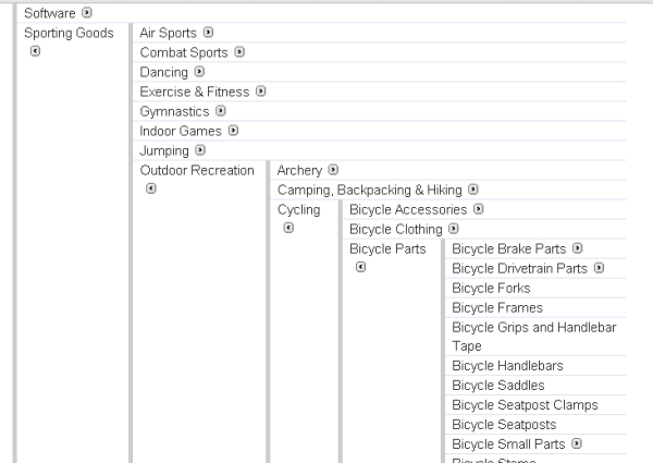
Sports and Outdoors > Cycling > Frames and Framesets > Framesets (include the fork) > Commuting/Cargo
Try to define your category first, then check your work against the overlord of all things taxonomy and classification, Google:
Now change your category structure to make it like Google. Why am I acting like such a badass when it comes to Amazon, but shrinking from going against the Google grain? Because Google’s in the business of getting your products found by people who need them. Think your product is unique enough that you need your own taxonomy and should ignore Google’s? Make sure you haven’t been drinking, and then model it as closely as possible, because chances are you’re wrong, but always keep in mind that you can be more specific than Google. Once they stop at “bicycle frames,” for instance, I might keep sub-dividing into “frame” and “frame and fork” categories. Whatever you do, never be more vague than they are. Why not just check the Google link I’ve provided first? Because you want to train yourself to think in terms of categories. It’s like crunches for the rippling six pack e-commerce abs you’ll eventually have. One day you might be sitting in a room listening to a pitch from a search engine ranking specialist, and suddenly realize–thanks to your well developed understanding of this stuff-that he’s full of shit. You’d be surprised how big an advantage instinctive organization can be when it comes to getting your information found, and making site visitors happy.
“Attributes” is by now a technical term in the world of content management systems for serious e-commerce companies, but everyone should use them. Simply put, they’re aspects of a product that lets people compare it to other similar products. “Color” and “size” are examples of very common attributes, but when thinking about what you want to sell, you want to be much better organized than just listing these really common attributes (sometimes referred to as “options” because they’re the attributes that most often show up in pull-down menus on product pages). Knowing a fill list of your product’s attributes means answering all questions a consumer might have–consumers tend to like that. For examples of bad or completely missing attributes, try to buy something complicated off Craig’s list. Here’s an example from the Big Dummy frameset I’m going to sell:
- Frame Material
- Head Tube Type
- Fork Steerer Tube Diameter
- Seatpost Diameter
- Rear Dropout Spacing
- Rear Dropout Type
- Maximum Tire Size
- Wheel Size
- Front Dropout Spacing
- Water Bottle Bosses
- Color
- Size
So that’s the list of questions you want to be able to answer for your site visitor. Think of the resulting set of attributes as “tags,” because all attributes are essentially information tags that help people find things. And by all means refer to Amazon and other retailers already selling the item in question, and check out their attributes, too. There’s always a chance they thought of more attributes than you have, and your goal should be to answer all of the customers’ questions as quickly and easily as possible.
From here we want to look at some free and simple resources that are out there to help you merchandise your product. That’s where we’ll be going next.


